
Client:
Ilmarinen
2023-2024
Projects:
Digital services brand refresh
Henkilötason päätökset
Maksuluokkalaskuri
Työnantajan verkkopalvelut
Ilmarinen Design System
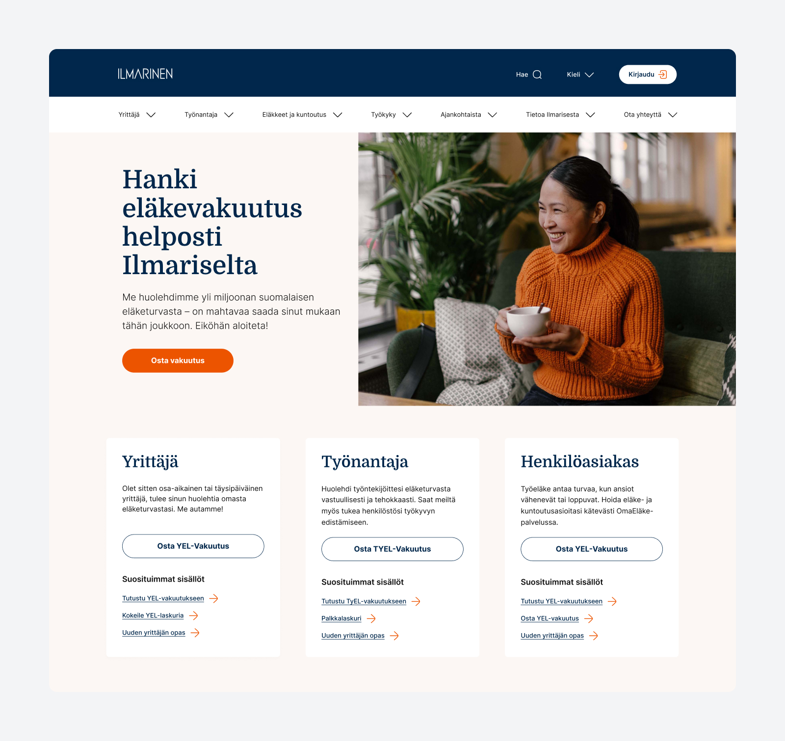
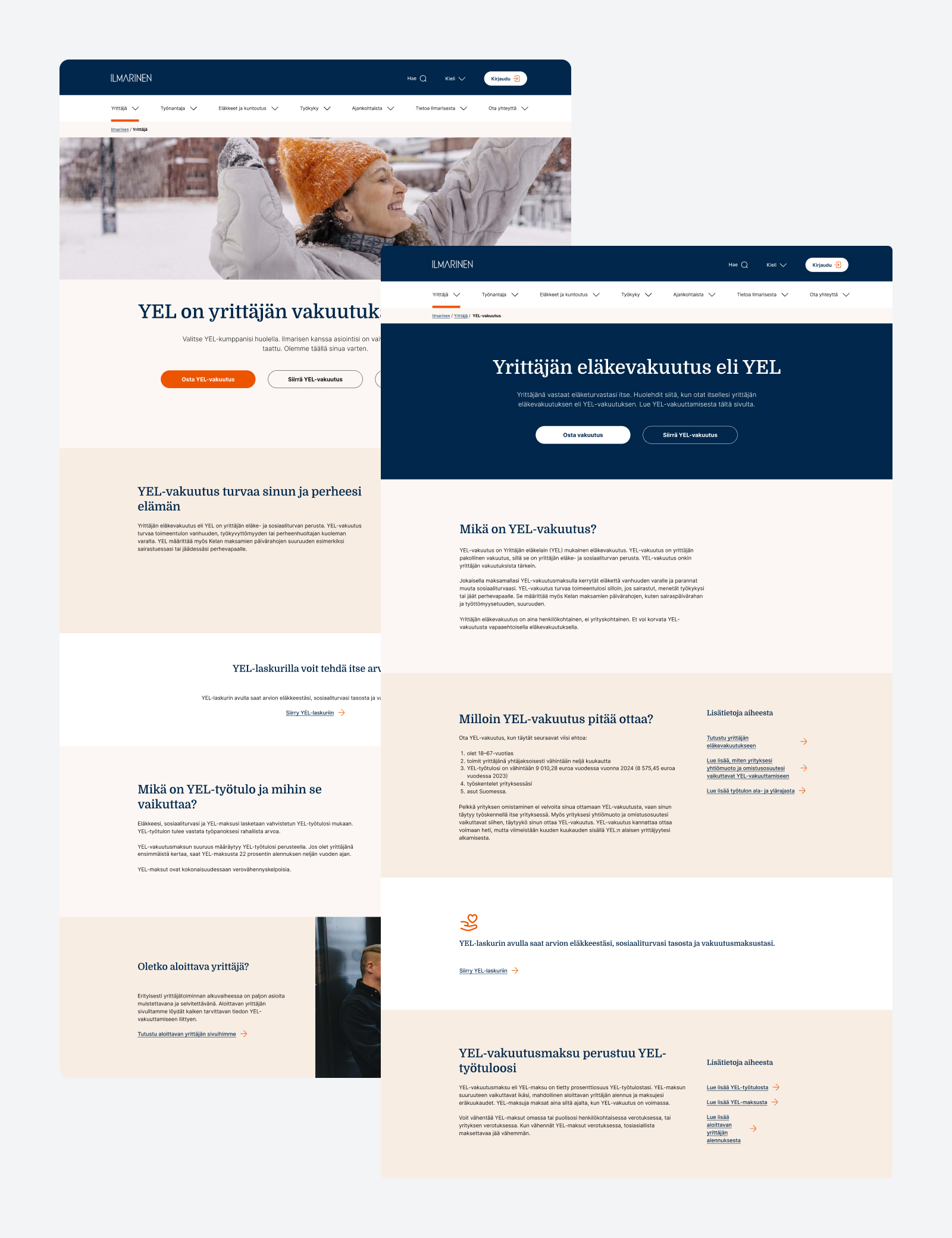
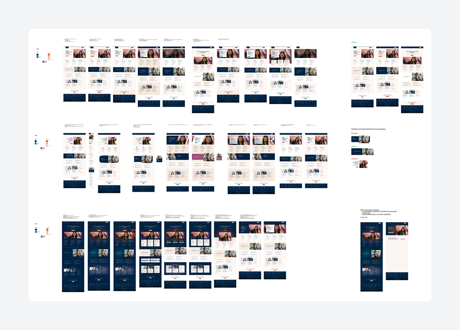
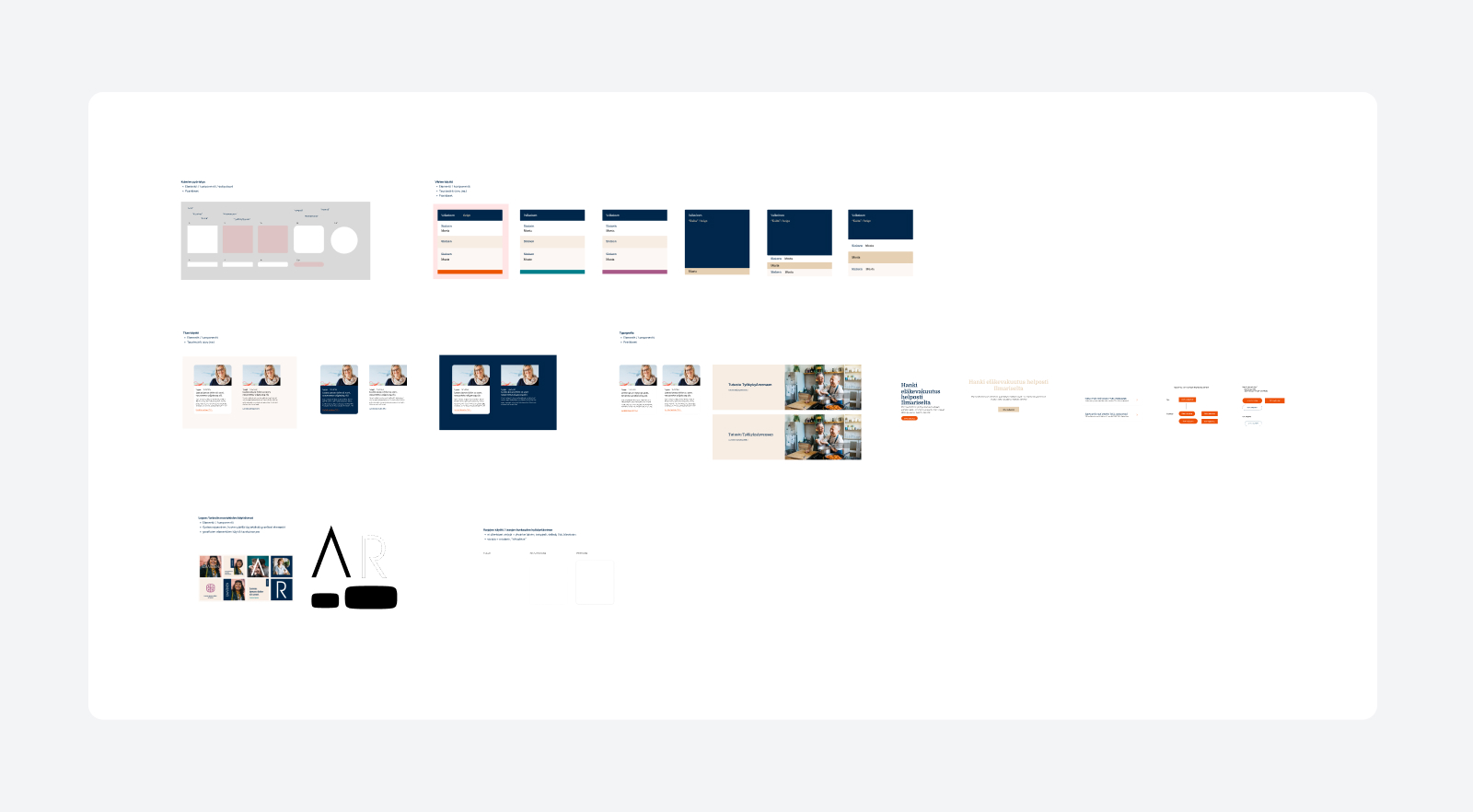
Digital services brand refresh
The Project
While an external agency had created a refreshed brand identity for Ilmarinen, the updated visual language had not yet been translated into their digital product ecosystem. Ilmarinen operates around ten distinct client-facing digital services, each with its own legacy styles and stakeholder priorities. The objective was to adapt the new brand guidelines for digital environments, align five key business owners around shared priorities, test the updated styles across all services to see how it works in the environment, and roll out the new visual identity through the central Design System for future development.
My Role
I led the digital brand adaptation, stakeholder engagement, and design rollout across Ilmarinen’s entire digital ecosystem.
- Digital Style design & Workshops: I planned and facilitated interactive workshops with key stakeholders, including brand & marketing and business, to define how brand colors, typography, imagery, shapes and overall design language should behave in digital UI environments, iteratively refining concepts based on feedback between sessions.
- Stakeholder Alignment & Business Prioritization: I engaged with the five main business owners across the organization to align competing business priorities, establish a unified strategic focus, and build consensus for a multi-service rollout.
- Service-Specific Stakeholder Collaboration: I collaborated with service-specific teams across all ~10 digital product stakeholders to identify quick usability wins and simple functional improvements along the way to maximize project value.
- System Integration: Once the concepts were validated in the organisation, I updated the core Design System components and tokens to ensure all future service development adhered to the new brand standards.
Why It Matters
A brand refresh on paper means very little if it cannot be successfully translated into daily digital touchpoints. Visual concepts often lack practical technical feasibility, usability and accessibility standards, leaving internal teams to bridge the gap.
By pairing structured stakeholder workshops with immediate practical service tryouts, design leadership transforms a brand update into an inclusive, organization-wide transformation. Adding these visual updates directly into the central Design System ensures that the new brand identity scales effortlessly, eliminating design debt and maintaining visual consistency across every client touchpoint.
Henkilötason päätökset & Maksuluokkalaskuri
The project
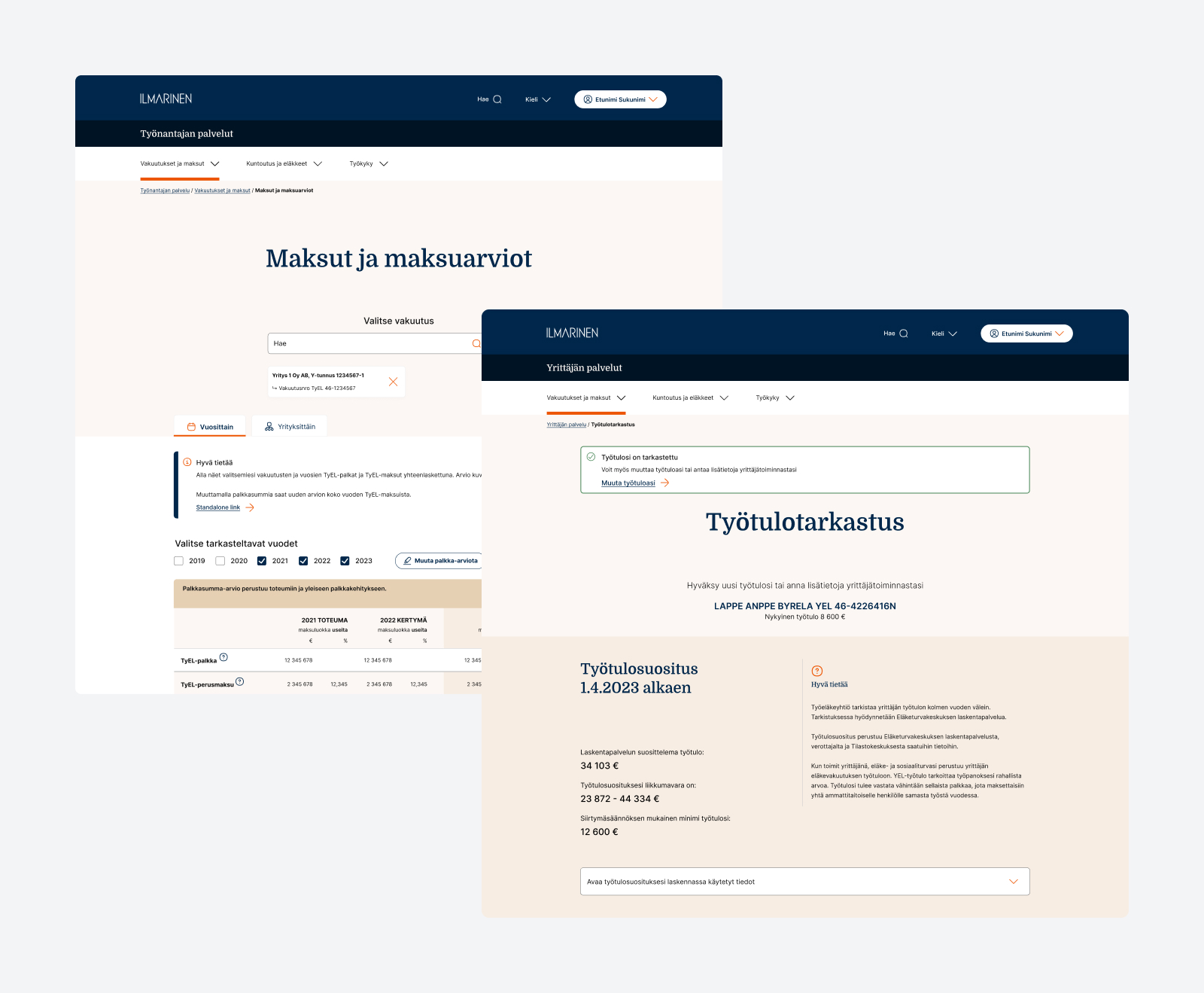
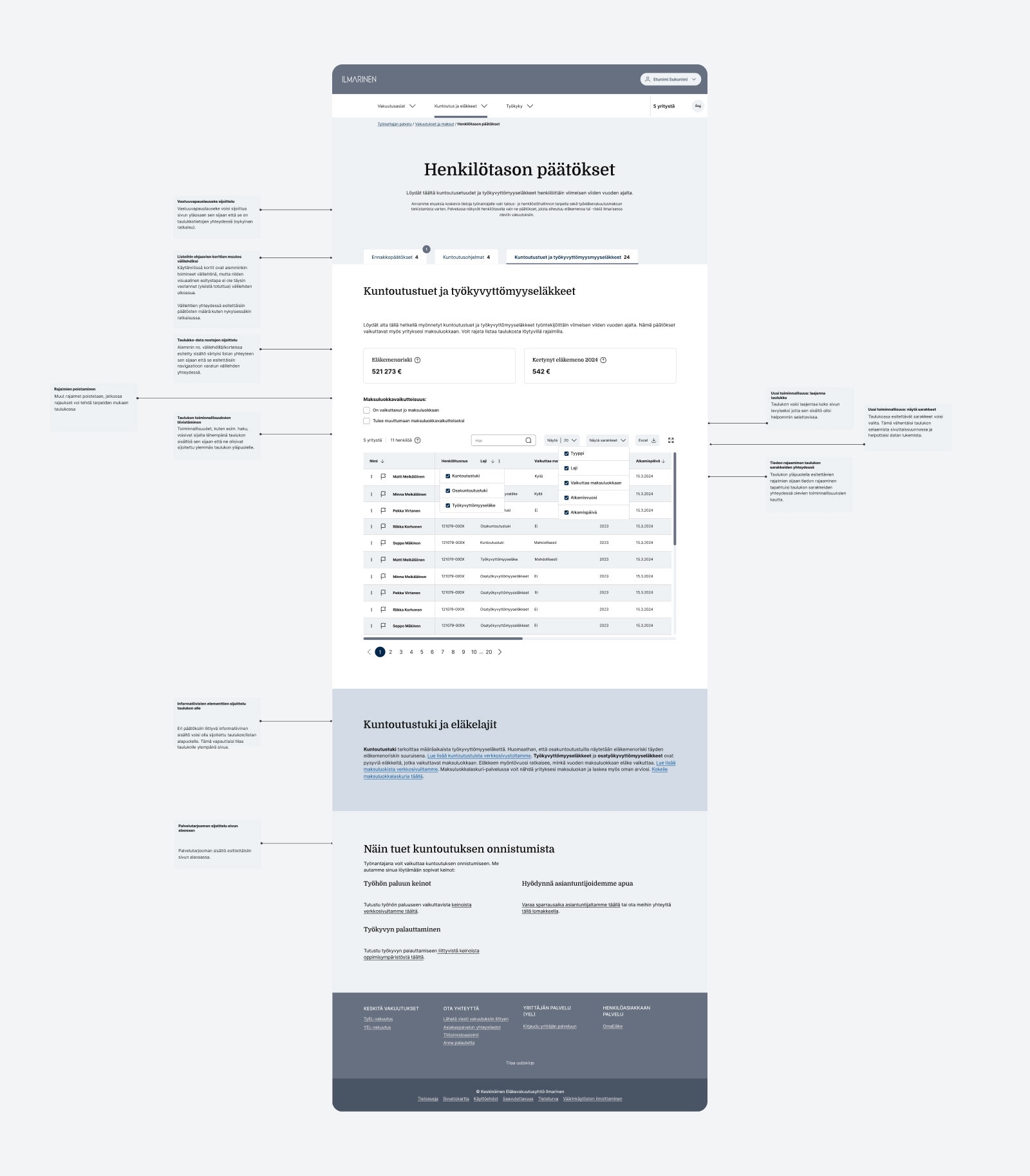
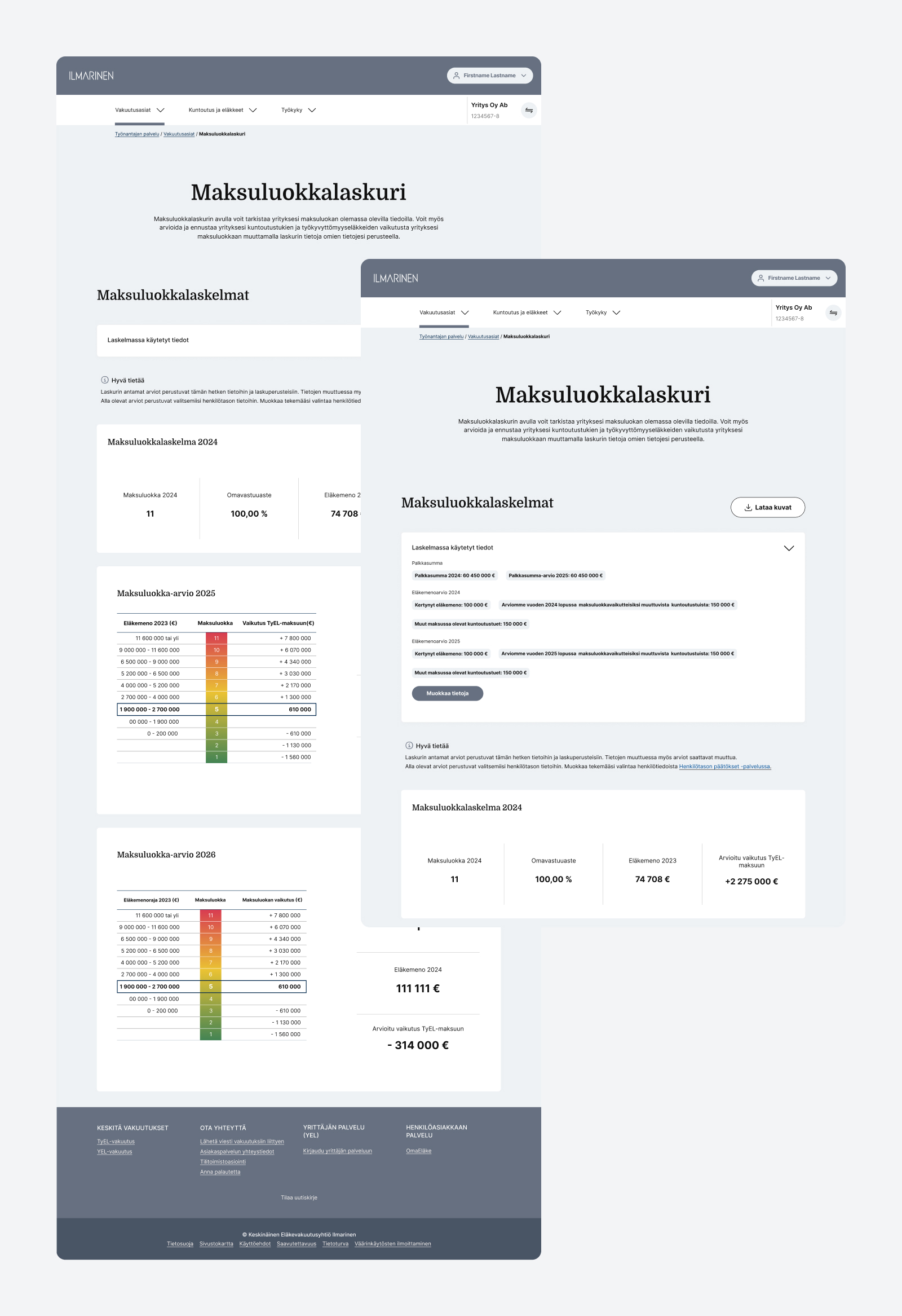
Ilmarinen needed to modernize two interconnected B2B services serving corporate HR and financial decision-makers. The first, Henkilötason päätökset (Individual level pension decisions), is a data-dense portal tracking employee pension statuses including full, partial, disability, and vocational rehabilitation cases that required advanced filtering, sorting, and structural usability updates. The second, Maksuluokkalaskuri (Payment category calculator), is a interactive financial forecasting tool enabling companies to simulate risk tiers and project future pension payment obligations. Both services required structural updates, more features to data handling, and usability validation.
My Role
I led the design for both interconnected services, working alongside an internal design colleague to test and validate the solutions.
- Data-Heavy UI Features: I redesigned new features to the Henkilötason päätökset employee status data, introducing intuitive sorting, filtering, and structural layouts to help corporate clients navigate high-density information effortlessly.
- Interactive Financial Modeling: I modernized the Maksuluokkalaskuri experience, translating complex risk-category formulas into clear, visual scenario-testing tools where business representatives could simulate variables and understand their financial impact.
- “Blueprint” Prototyping: To keep early stakeholder feedback focused strictly on information architecture and functional logic rather than visual aesthetic, I designed both services using brand-neutral blueprint styling while maintaining core UI structural patterns from the broader brand refresh.
- User Testing & Collaborative Validation: In close collaboration with a client design peer, I conducted user testing sessions with target B2B users to validate new features, refine data layouts, and ensure high operational clarity before final production rollout.
Why It Matters
When dealing with enterprise B2B portals, data density and complex financial calculations can easily overwhelm business users if information hierarchy is poorly structured. Leveraging brand-neutral “blueprint” prototypes during early validation prevents visual bias, ensuring that structural mechanics and user workflows are proven before applying final styling.
Työnantajan verkkopalvelut
The Project
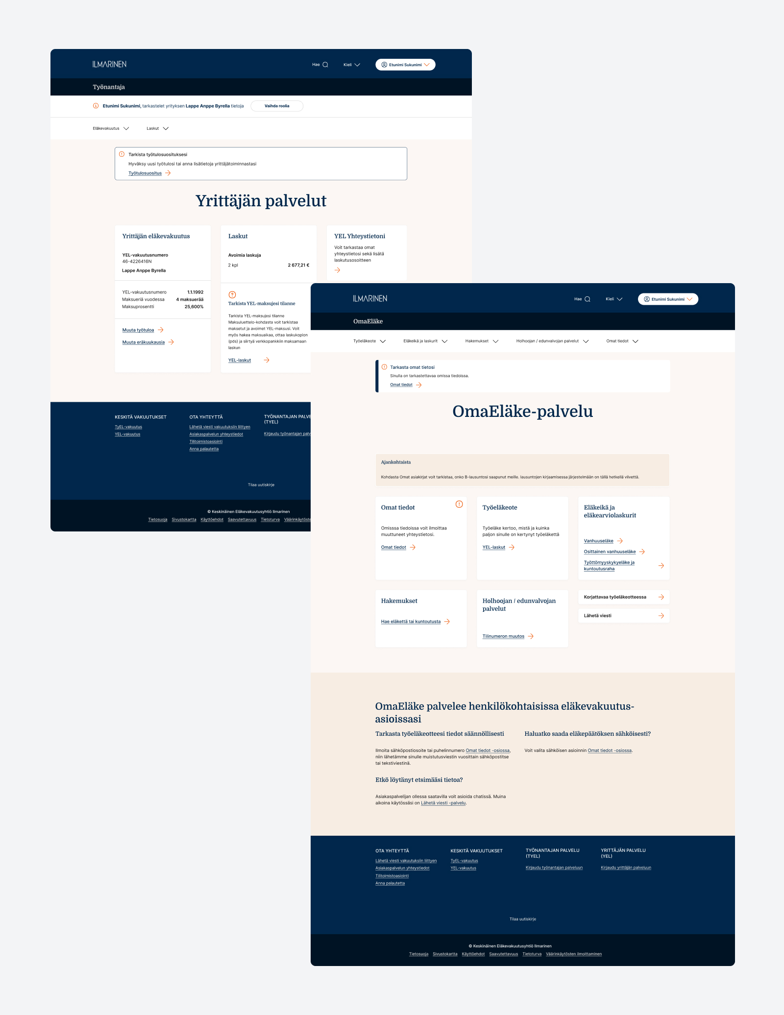
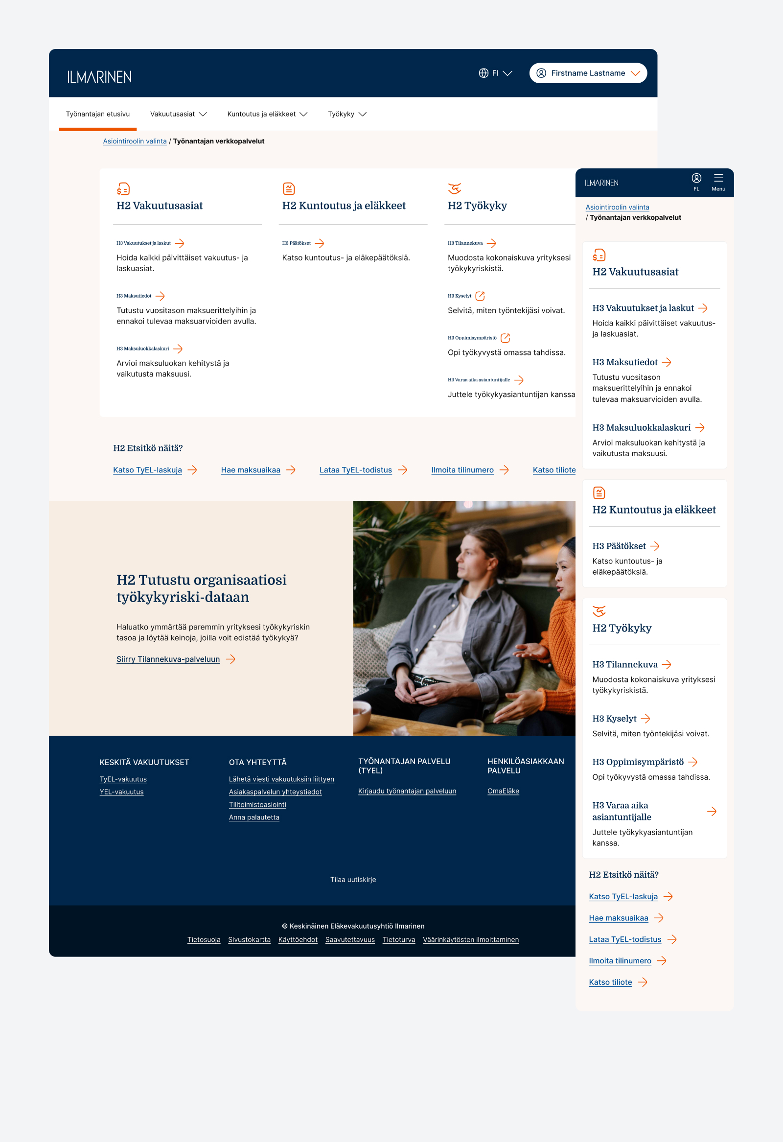
Ilmarinen’s Työnantajan verkkopalvelut is the primary B2B portal for corporate pension insurance. Customer feedback showed that the original portal was fragmented and hard to navigate, as services were built as separate micro-services with varying client access levels. The objective was to redesign the landing page into a clearer way to navigate, improving usability of the services in the ecosystem.
My Role
I led the redesign of the portal, focusing on information architecture, ecosystem navigation, and visual alignment with Ilmarinen’s digital brand refresh.
- Redesign: I restructured the main landing page and entry points, transforming a fragmented set of standalone services into an clearer group of provided services so that B2B customers can find relevant tools more easily.
- Usability & Navigation Enhancement: The core usability bottlenecks identified in customer feedback were addressed by establishing a clear visual hierarchy and simplified content pathways.
- Brand Refresh Rollout: Following the company’s broader brand refresh, I updated the service’s visual look and feel, applying the newly established design system tokens and components for unified brand consistency.
Why It Matters
For major corporate clients, a B2B portal is not just a portal—it is the primary everyday touchpoint for managing significant financial and administrative responsibilities. When service options are gated or fragmented, poor usability creates administrative friction, drives up support calls, and negatively impacts client satisfaction.
Redesigning the portal front page as a clear, intuitive “doormat” bridges the gap between complex background architecture and seamless user experience. Structuring the ecosystem around customer needs ensures that key accounts find immediate value, while establishing a modern visual identity that reinforces trust and reliability in Ilmarinen’s digital services.
Ilmarinen Design System
The project
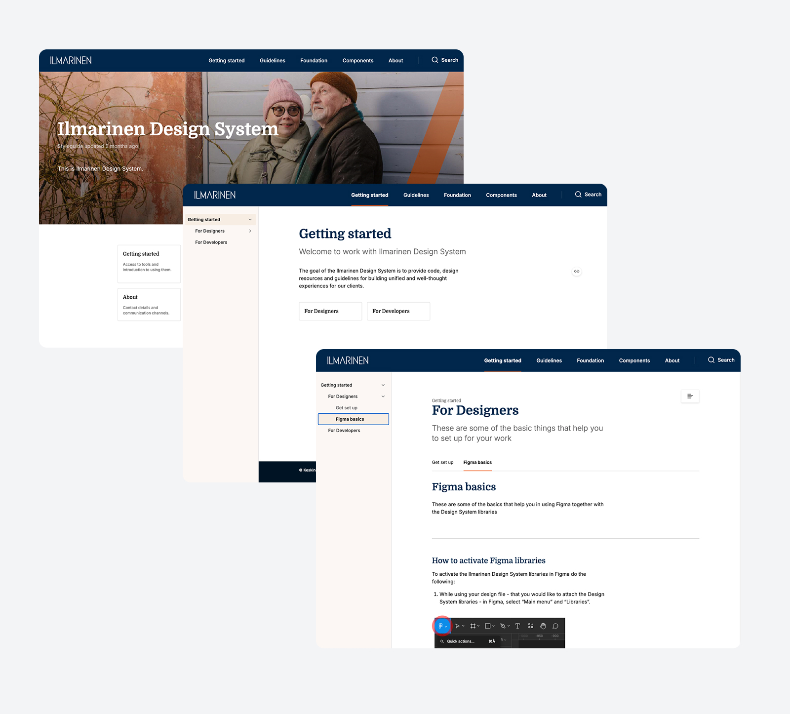
I led the design system redesign from evaluating the existing Sketch components to executing a complete rebuild in Figma, aligning components with code, and establishing central documentation.
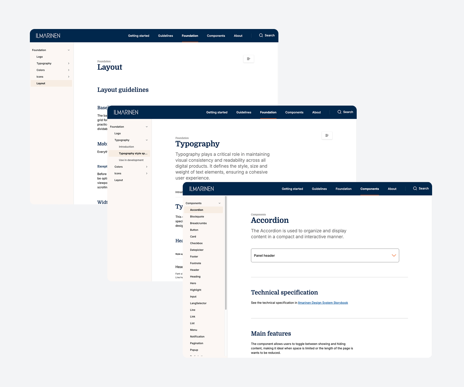
- Tool Migration & Technical Rebuild: I reviewed the legacy Sketch library and completely rebuilt the components and their structure from scratch in Figma, establishing foundations for color tokens, typography scales, and spacing frameworks.
- Brand Refresh Integration: Following a digital brand refresh, I adapted the new visual language into scalable Figma components and updated the visual appearance across the entire library.
- System Build: I partnered with a front-end developer who brought the design system components into code and set up Storybook. My responsibility was to build and structure the Zeroheight platform for central documentation and connect the components to the documentation.
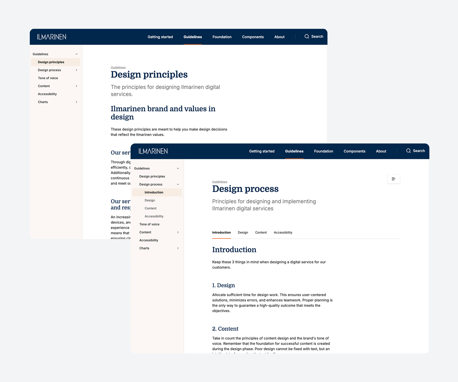
- Holistic Guidelines & Accessibility: I expanded the documentation beyond traditional UI specs to include overarching brand guidelines, design principles, and layout standards together with the client. Working with a dedicated accessibility expert, I co-created detailed accessibility guidelines tailored for both designers and developers to ensure compliance across all services.
Why It Matters
A design system is far more than a collection of visual components; it is a strategic asset that bridges the gap between design, code, and compliance. Moving from a legacy, design-only Sketch setup to a modern Figma-to-Storybook workflow dramatically improves production speed, eliminates design debt, and ensures visual consistency across all digital touchpoints.
In a highly regulated sector like pension insurance, accessibility and clarity are critical. By expanding the documentation to encompass accessibility guidelines, layout rules, and core design principles, the design system empowers the organization to build inclusive, compliant, and cohesive digital experiences independently and efficiently.
The Client
Ilmarinen is Finland’s largest private employment pension company, managing mutual pension cover for approximately 1.1 million insured individuals and over 80,000 employer and self-employed clients.
See also: